Carbon Contributors
The goal of this project was to offer a redesign of an existing data visualization, Tracking Carbon Emissions by Stanford Kay Studio. It was created under the guidance of Dr. Jodie Jenkinson at the University of Toronto.
The topic of this visualization is total carbon dioxide emissions by nation and per capita, created for an educated general public. The original graphic had the goal of comparing these metrics within each country, as well as between countries and geographic regions.
The first step was to identify areas for improvement in the initial design. While the original is visually appealing, one weakness is that a viewer cannot easily compare similarly-sized dots because accurately comparing area is difficult perceptual task. I address this in my redesign by placing my data-points on a common scale, so that values can be compared based on their position in 2D space. Another weakness in the original design is a lack of visual connection between measurements for the same country – a reader must scan and match text labels in order to compare values for a specific country.
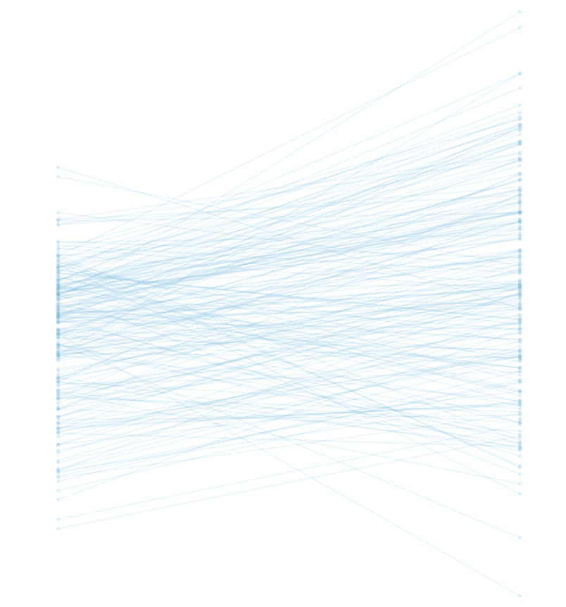
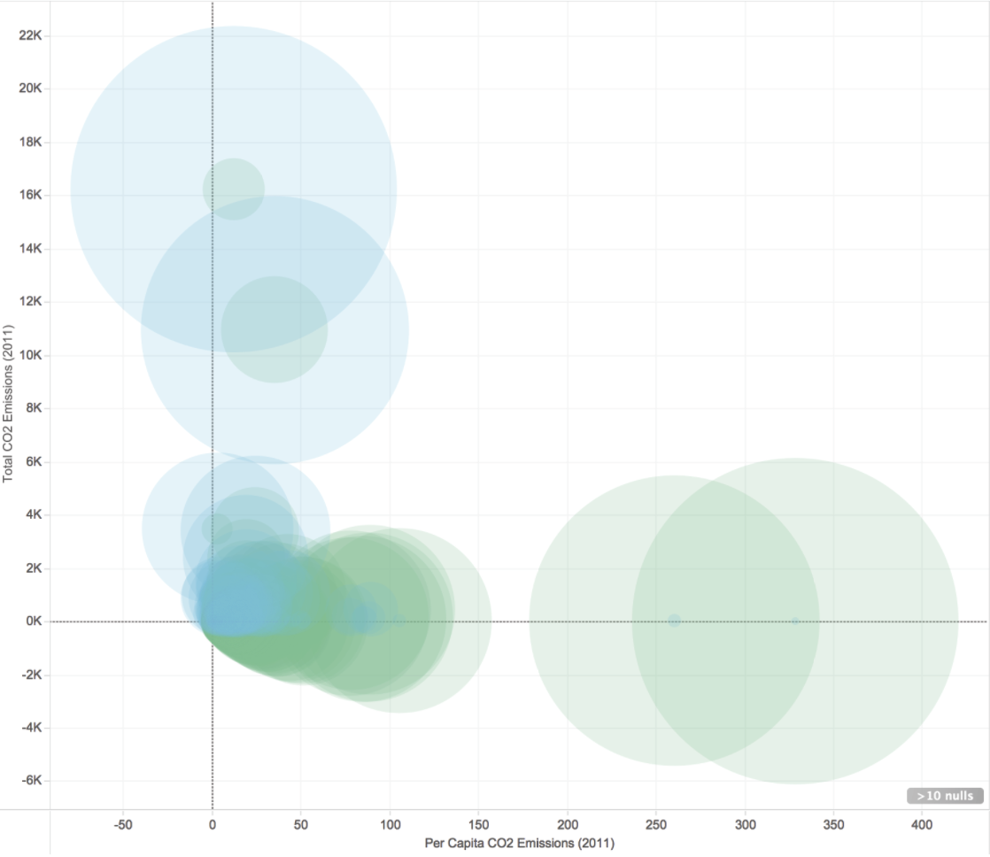
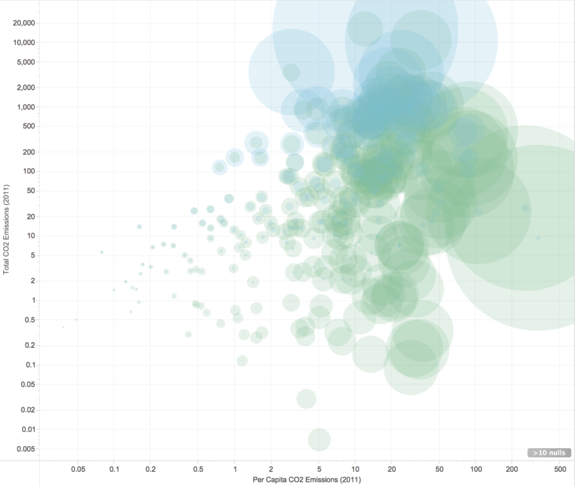
The final aesthetic was very much inspired by Jan Willem Tulp’s beautiful, beautiful piece Ghost Counties.
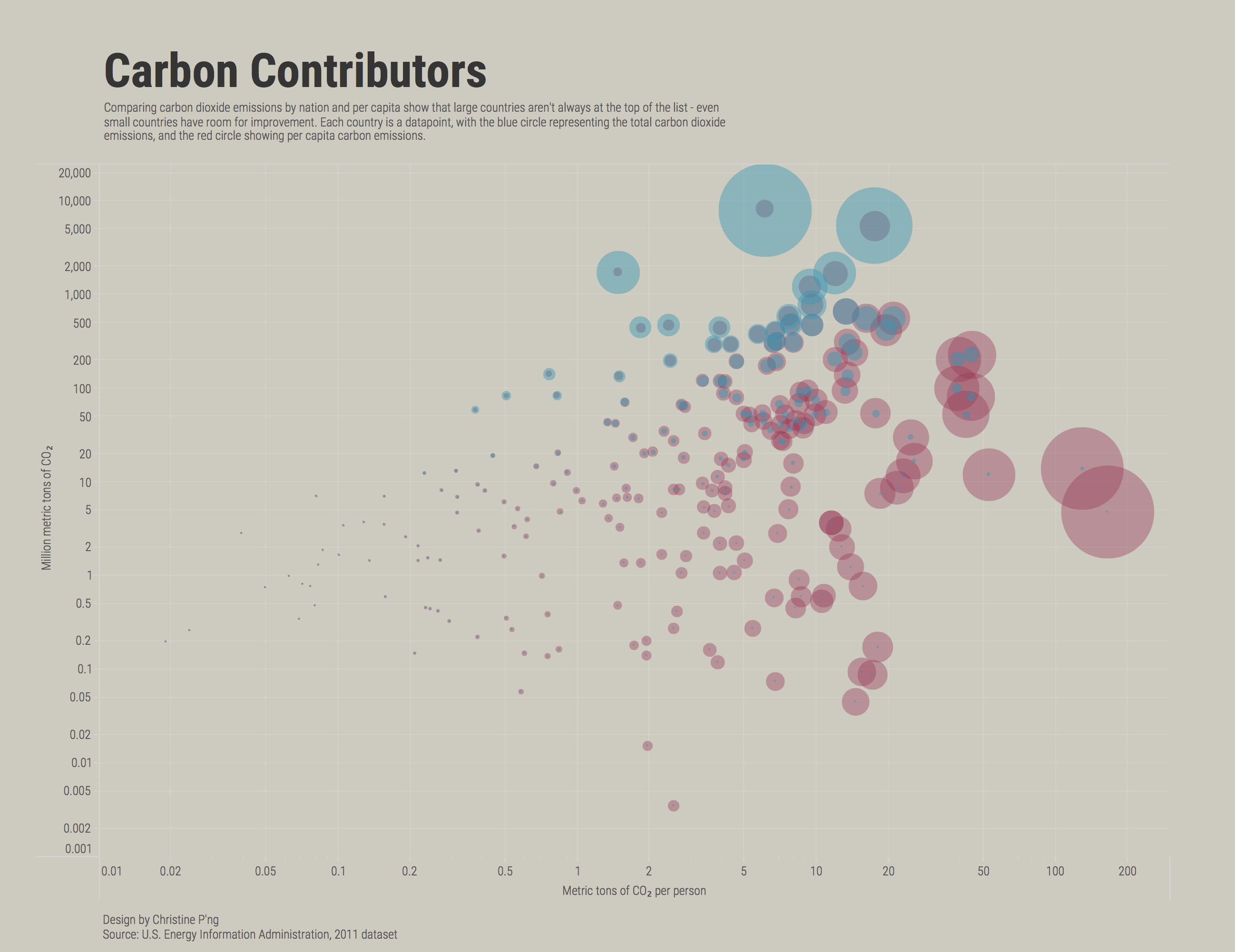
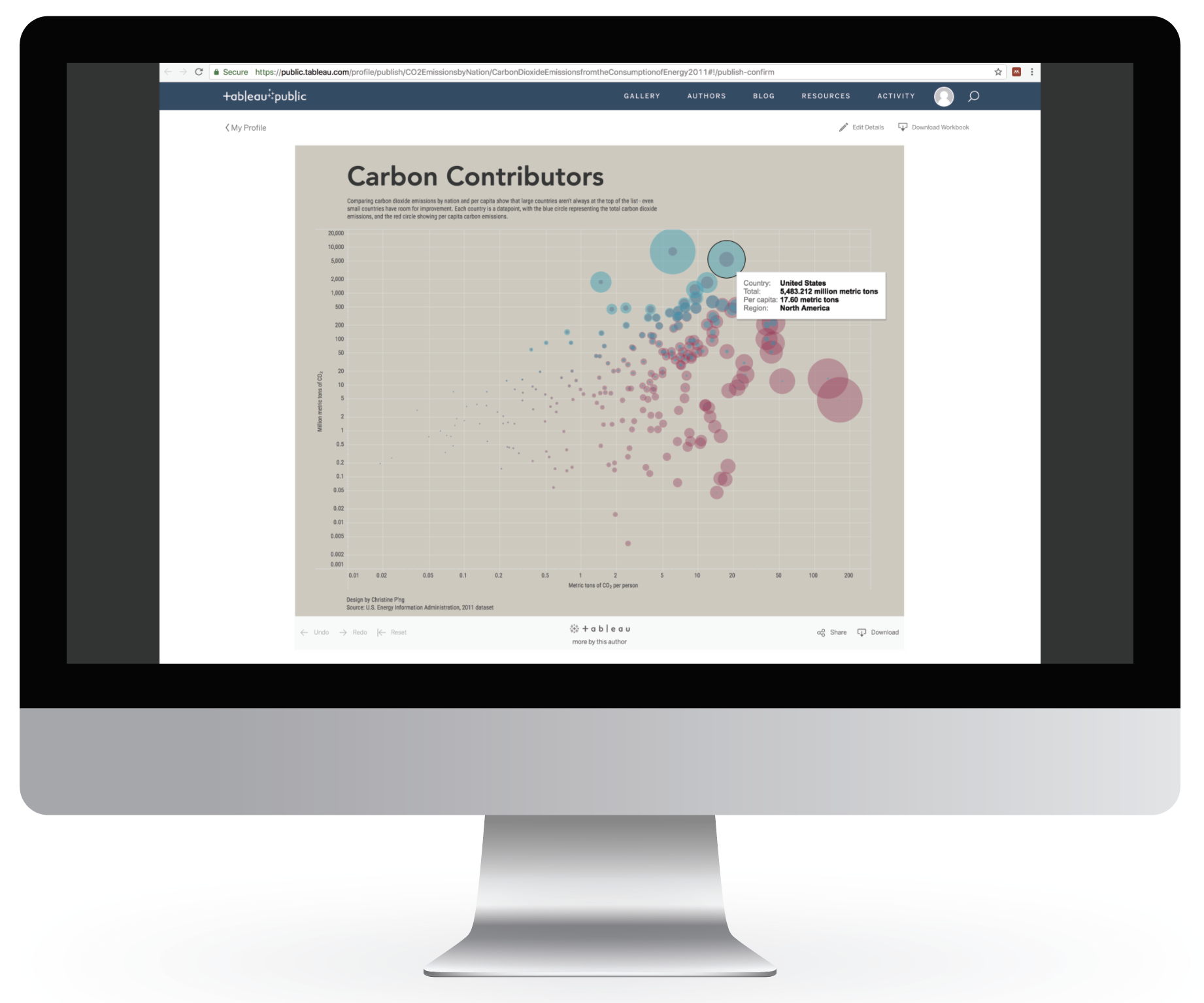
I used area to encode the data, in addition to position on a common scale. The use of area provides an “at-a-glance” reading of the data, while position and a tooltip allow for more precise accuracy in interpretation. In addition, using area assists in offsetting a potentially confusing design choice: logarithmic scales. The axes were necessarily converted from linear to logarithmic scales to prevent crowding of the data points, and this can potentially mislead an audience. However, the sizes of the data-points vary linearly, and this helps the viewer assign the appropriate value to data-points.
Other design choices include omitting a legend for the areas. Rather than expect viewers to map data- points to a legend, a hover tooltip provides accurate annotation. The blue and red colour coding is another repeated annotation, to give quick overview information. The overall design relates to its topic by mimicking gas bubbles floating into the atmosphere.