Dear Data
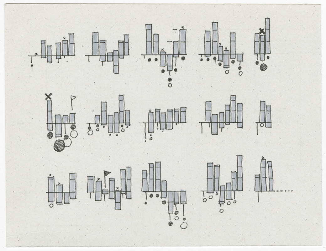
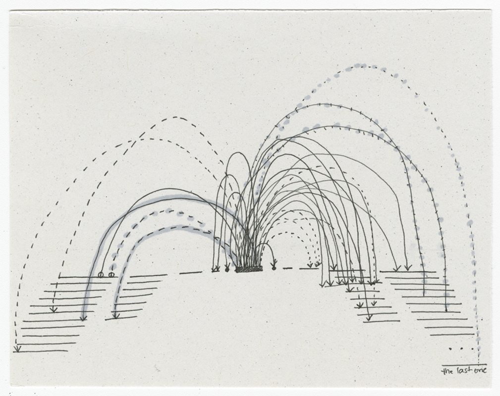
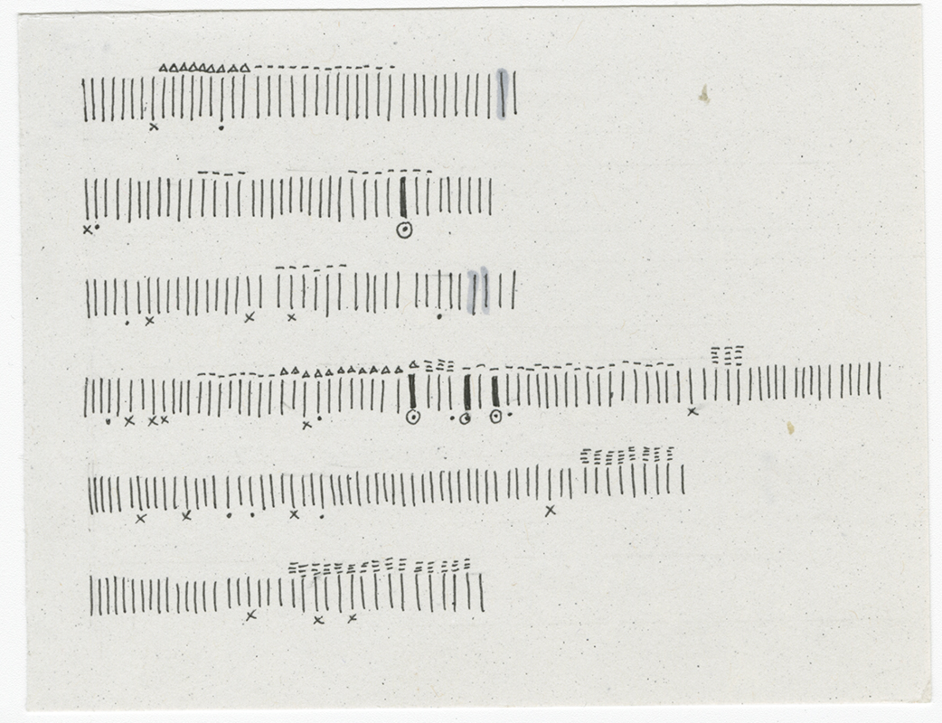
Inspired by the Dear Data project by Giorgia Lupi and Stefanie Posavec, I spent three months creating my own Dear Data postcards, where I chose one topic to track each week, and visualized the resulting data.

As I worked on these postcards, I developed some rules for how to choose a good postcard topic. It’s my opinion that you want to choose a topic that’s (a) reasonably interesting to you, (b) happens more than a couple times in a week, but not so many times that it’s impractical to take note of, (c) is a discrete event - something that can be counted, and (d) is salient in your mind when it happens. The reason for (d) is that postcard tracking can be quite distracting because piece of your attention all week is taken up with watching for a particular event to happen. Therefore you want to choose things that you’ll notice as soon as they happen, that you don’t have to consciously watch for. Ex, times you said “sorry” is much easier than hearing compliments, because one is a direct pattern match (that you yourself say), while the second requires interpretation and conscious listening.

There’s a written piece I love called Data Will Help Us, by Jonathan Harris. One line in it reads, “not everything that counts in our lives can be counted.” And I would add: not everything that can be counted should be counted. Some topics don’t provide worthwhile insight – they either didn’t teach anything that you didn’t already know, and can heightened your awareness of parts of life that aren’t worth reflecting on.

Dear Data for me was an incredibly illuminating and reflective exercise (and a fun design challenge!). Each week I learned something about myself or the people around me. I would do it again!